BHA Introduces New Logo Branding!
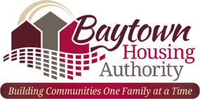
Baytown Housing Authority (BHA) recently rebranded their logo. The logo rebrand was created by Brooks Jeffrey Marketing, Inc. and will be used on the new responsive website launching in July 2024.
The rebranded logo utilizes a similar red color to the previous logo, although a new color scheme was used. Maroon, gray, and beige colors were added to establish BHA's new branding and add emphasis to the words and icons included in the new logo. The swish icon and different fonts were used in the new logo to give it more depth. The slogan "Building Communities One Family at a Time" and the square icons representing the building bricks of a home were incorporated and enhanced from the previous logo. The brick icons correlate to the slogan "Building a Home One Brick at a Time". In the new logo, the brick icons were emphasized to be like a shadow of the three house icons shown above it. The three house icons were also utilized from the previous logo to relate BHA with 'housing' and correspond with their communities.
The new logo is easily identifiable & easy to read. Importantly, the new logo will be easy to reproduce on a variety of marketing and promotional products to further promote the goals of BHA.
For more information about the logo rebrand, please contact us.
New Branding:

Old Branding:


